Text that creates backgrounds
February 22, 2011 Leave a comment
EXTRA-LARGE HEADLINES
Looks like designers are having themselves a field day with big, bold headlines. The kind that stop you in your tracks and make you read.

This site has the outsized headline in lower case and the content in all caps in a smart yet simple design that optimizes the use of color and type.

Courtesy: LemonDesign Here every word begins with the letter ‘A’ which takes center-stage in no uncertain terms.
Create visual impact while leaving an impression with your message. Here’s some big, bold type to speed you on your way! Choose from an array of exciting fonts.
TEXT THAT TALKS IN PICTURES

Different forms of the word “coffee” make up this extremely inviting steaming cup of coffee formed completely with text.

Information Highwayman uses text to form the image of a pistol, to support the central idea of ace web content and design content being an ‘attention-thief’.

Type forms the shape of the number “21” – big and bold – a young designer’s announcement to the world that he has arrived.
TEXT EFFECTS WITH PHOTOSHOP
 |
 |
 |
 |
3-D text, glowing text, neon text, text on fire, text in stitches, gold text, copper text, smoky text, wood-cut text effect, glass text, reflective text… the possibilities are endless. Look up some handy tutorials to get yourself up to speed on these terrific text effects.
IMAGES IN TEXT

OUTSIZED LOGOS

With the web getting more and more crowded for space, an extra-large logo gets you noticed and gets a share of your visitor’s mindspace – at least until the next Google click! Whether he comes back to your site again, however, depends on whether he found your content useful or interesting. This site focuses attention on the designer’s name – Finch, and uses italics, caps and different type faces intelligently in the design.
CONTRASTING FONT STYLES
You can use contrast effectively with thin and bold fonts, graceful flowing fonts or “I mean business” fonts, colored or black and white fonts, caps, sentence case and italics – experiment with fonts to draw attention to your message.
Caution: Before experimenting with this style, just be aware that you need a practiced eye for design and a view for the larger perspective of “What am I trying to say?”
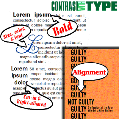
The late typographer Carl Dair compared typography to music, in describing how seven kinds of visual contrast in harmony, size, weight, form, structure, texture, color, direction, rhythm make typographic design stand out. The contrast has to be visible and perceptible in order to be noticed. Different kinds of contrast may be used together much in the same way as a musician would use a chord — different notes forming a harmonious tone.

TEXT AS COLLAGE
Colorful text in different sizes makes a communicative poster.

Here’s a handy tutorial on creating Text Art with Wordle and Photoshop

TYPOGRAPHIC ART
This amazing picture is created with typography, using photo editing software called Artext
Be inspired!


Today there are exciting tools for designers to play around with type. It takes a designer who truly cares about the message, to use type not just as eye-candy but as a medium to get the point across expressively.
